Live life in colour, so the saying goes, and yet we continue to be moved by monochrome.
Photographs are a great illustration of this. A colour photograph of, for example, a building or a person, may be eye-catching but switch it into black and white and suddenly it’s breath-taking.
Curious isn’t it? Perhaps it’s something to do with the drama created by contrast, or the beauty in simplicity.
Babies love high contrast and although we tend to surround them with primary colours, when they are newborns they prefer black and white.
Their sight is not fully developed and so their perception is limited. High contrast images stand out for them and help them to focus through the blur.
As grown-ups in the modern world, perhaps we need something to focus on through the blur. Maybe black and white is ‘easy’; putting fewer demands on us than colours competing for our attention.
A monochrome scheme is also less demanding to put together. Items are either black or white or both, although grey may have to feature, especially if there’s artwork.
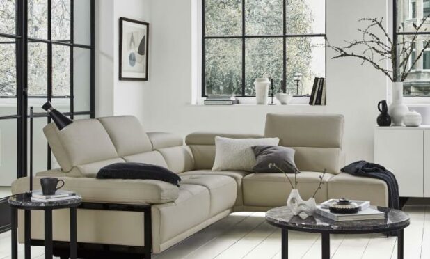
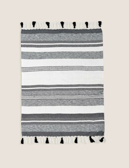
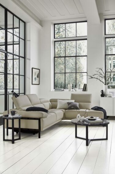
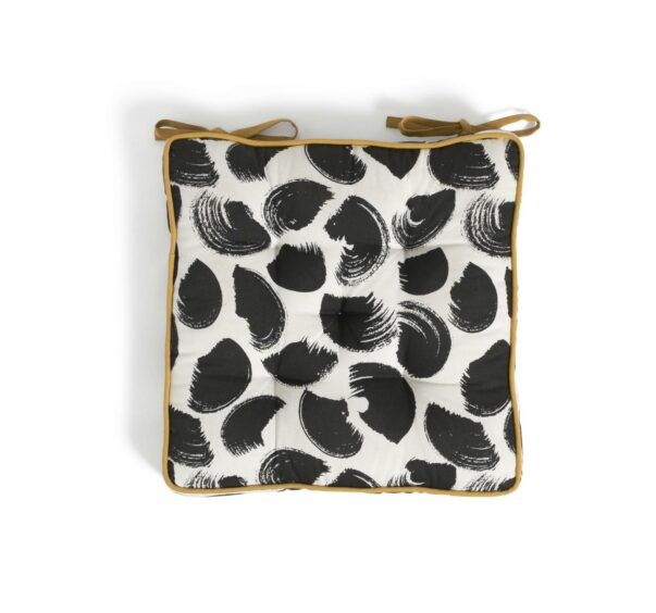
It’s hard to go wrong from an interior design point of view with this as your palette. Everything will match and look as if it’s meant to be there, even if pieces have different styles or patterns.
The trick is to get the balance right and not fall into the trap of buying a lot of black furniture, then throwing in a single white cushion and calling it monochrome.
White needs to headline, although it is high maintenance, in order to achieve the classy, curated look that will turn the heads of babies and grown-ups alike.
