There’s a moment in a YouTube documentary series about Virgin Atlantic’s purchase of the Boeing 787 Dreamliner when the design lead, Nik Lusardi, discusses the colour of the Upper Class cabin with the production crew.
“Black cherry and espresso,” says Nik, pointing to one of the exquisitely and meticulously designed seats.
“Brown and purple?” says a voice off-camera.
“Black cherry and espresso,” insists Nik and then goes on to explain why that is the case.
There is no denying that Nik’s version is altogether more delightful and delicious and that these shades are in fact, exact matches for black cherries and espresso coffee.
Instantly, an Upper Class ticket promises not just a more comfortable journey but a sublime experience that is already appealing to all the senses with just those four words.
You see, some people take their colours seriously, and for product designers, interiors experts and yes, certain your life writers, that’s a very worthwhile thing.
It makes it possible to create themes and palettes that other designers may not have considered and to be very precise about it.
Nik’s seats were not tan, or walnut or chocolate – they were espresso, which is undeniably more grown up and sophisticated.
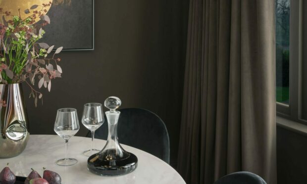
This summer and autumn home interiors are getting a caffeine shot of their own with a décor style that’s been dubbed Americano.
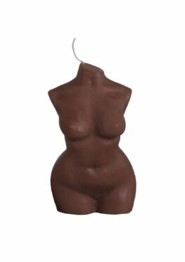
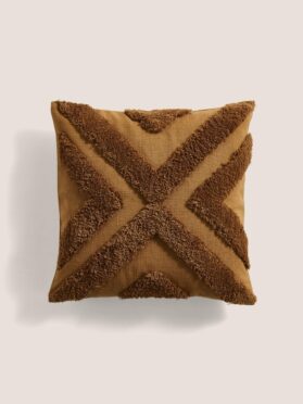
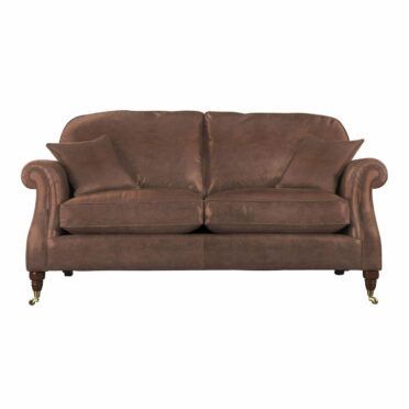
The coffee-inspired palette runs from café au lait, through cappuccino to double espresso and the effect is rich, warm and really rather luxe.
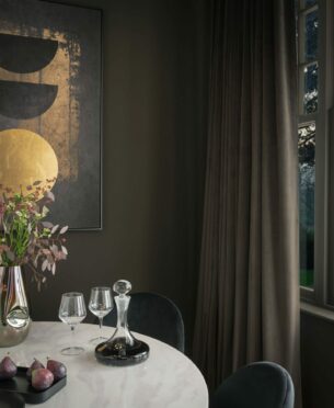
Dark woods meet stoneware and tactile furnishings for a look that works for chic boutique hotels the world over.
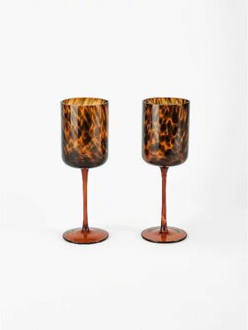
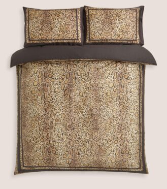
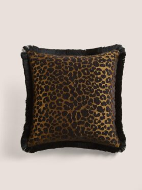
Throw in some leopard print or tortoiseshell for fun and add metallics for shine to stop all that brown becoming dreary.
As for what other colours go with the Americano theme, creams and grey-blues are especially classy – although nothing could possibly be quite as yummy as black cherry.
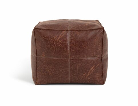
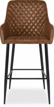
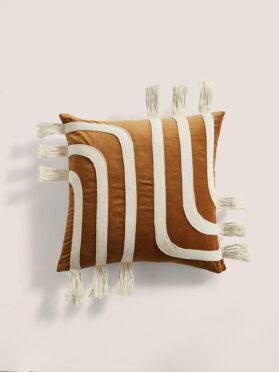
Top picks…
Conversation