In the second half of our two-part series, Cheryl Livingstone explores two very different homes designed by the same architect.
One of the best things about the Aberdeenshire Design Awards is the light it shines on the different types of innovative design that is present in our part of the country.
From art deco homes to renovated bothies, there is variety in their design and style. Having different owners could explain the difference, given that everyone has their own opinion of what looks good and what doesn’t, but this week we take a look at two homes that have been designed in part by the same person.
Architect Mike Rasmussen worked with both the owners of these properties to create homes that have brought a little bit of the past into the future.
Mill of Newe, Strathdon
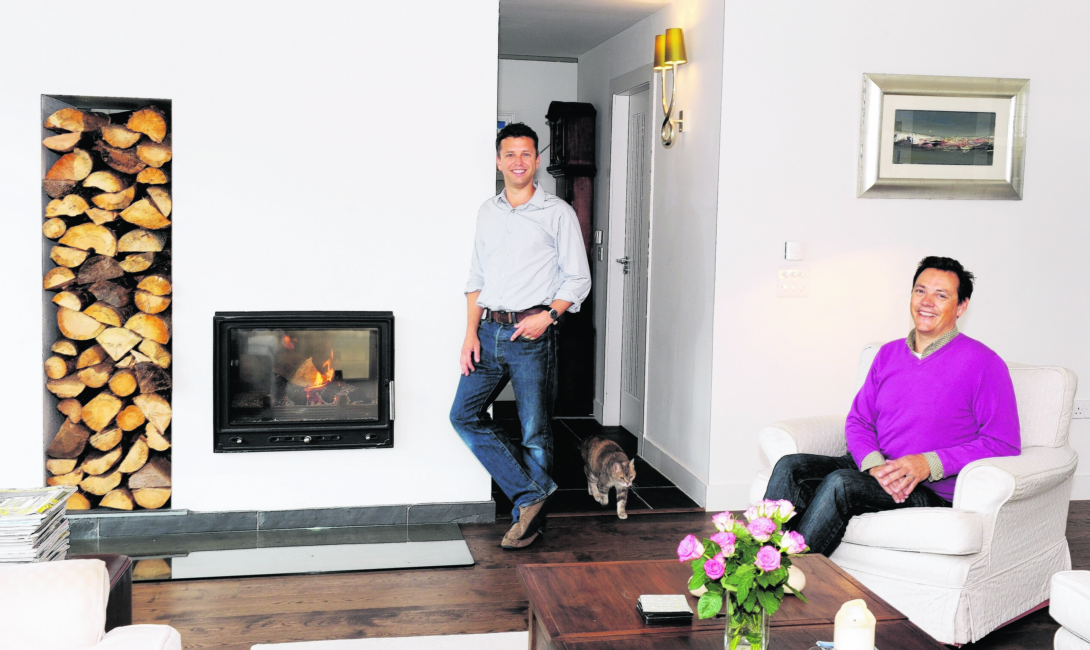
Gregor Hutcheon and John Morris were living and working in London when they decided to buy a second home that could work as an escape from city life.
As Gregor has roots in the north-east, they began their search there and soon found Mill of Newe in Strathdon. The house had been neglected and needed a bit of work, but the pair transformed it into a lovely holiday home.
The location was also a plus for them, especially commuting from London. Gregor explained that they could get up at 5.30am on a Monday and be at their desks in the middle of the capital for 9.30am.
Then, six years ago, they decided to take the plunge and move to Strathdon permanently. And while Mill of Newe had been an excellent holiday home, it didn’t quite work for them living there 365 days of the year.
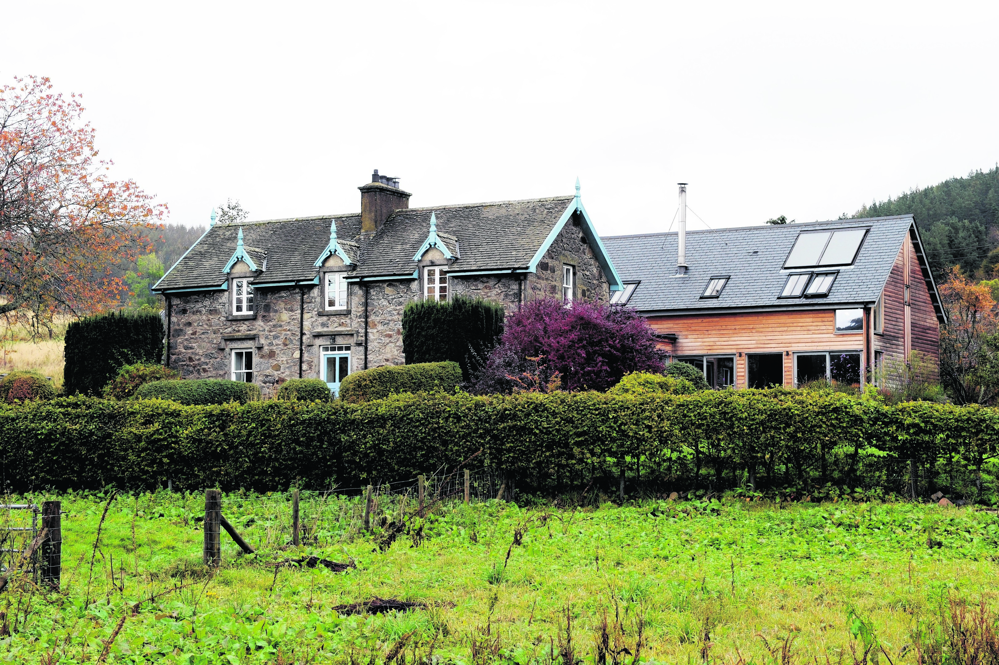
Gregor said: “It’s a cosy cottage; it has three bedrooms, kitchen-diner and a lounge, but as full-time it was not enough space. We decided to extend it and so we started exploring options for what we wanted to do.
“It’s a listed building so anything you did had to be sympathetic to the original building. It’s an addition to what’s there, but you can do it in a way that respects the character of the original building; you can do that with the size, the rooflines and so on.
“The extension is subservient to the original building. So we spent a lot of time working out how best to position the extension and how to connect it.”
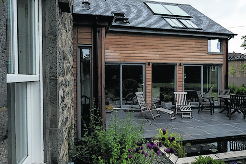
The pair have managed to achieve that sympathetic relationship with the colours of the roof, height and even having the chimneys match in the centre of the building. But inside, it couldn’t be more different.
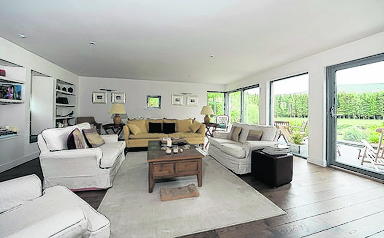
“The extension is much more open plan and light and airy,” Gregor said. “That was the second thing we wanted, a sense of place, with the extension. One of the frustrations I had with the old house was that it had quite small windows. They are cosy and keep the heat in winter but the views out are lost.
“So we wanted lots of windows that we could connect with the landscape and the views. The lounge has a panorama of floor to ceiling windows; you get fantastic views. And in my study, you get floor to ceiling window looking west that gets the evening sun.”
They were helped with their initial designs by an architect friend, but it was a tour of some buildings in Aberdeenshire that led them to Mike.
Gregor said: “We saw a couple of his local projects and that inspired us to contact him. He came up with a few options and between us we came up with the current design.
“When we came to the final design, we had been grappling with a lot of ideas about how we were going to connect it all and both Mike and I did some sketches and brought them together and they were more or less identical so that was ideal.
“The house is exactly what we wanted. It lifts the spirits, this place. We’ve just spent three weeks in Spain and you come back and it’s a gloomy day, but then you look around the house and you think, yes this is a lovely place to be.”
It is amazing to think what Gregor and John have been able to create – a modern contemporary home that beautifully complements the character and charm of its original section. Taking the time to ensure they got the best from their build is something Gregor is passionate about.
He added: “I get frustrated when I see new buildings go up and they are just boring boxes. And yet with just a little bit of effort, you could make them so much better.
“People think that good design costs money. It doesn’t. Good design is just a bit of hard work and thinking before you actually do it. It’s frustrating when you see that people haven’t taken the time to do things more imaginatively.”
Westwood Cottage, Insch
Ron and Anne McConnachie loved their cottage in Blackburn, but its traditional style just didn’t work for them.
With a separate kitchen and dining room, it meant the hosts were missing out on spending time with their guests. Couple that with a desire to create their own home, and it’s no surprise that they eventually did just that.
When Westwood Cottage came on the market and they went to visit it, they knew it was the one for them. The site originally had a bothy with an attached steading and barn.
The couple came across Mike’s name in a magazine and decided he would be the architect for them.
“We thought since he had a Scandinavian name, and I am from Scandinavia, that he would have good ideas,” Anne said laughing.
“He initially didn’t want to do it, but then when he came to see it he could see the potential.”
The couple already knew they wanted to use oak and so started to collect things that they saw from magazines, or would take photographs when they were out and about. From that, and discussions they had with Mike, he came back with a design which hasn’t changed much since then.
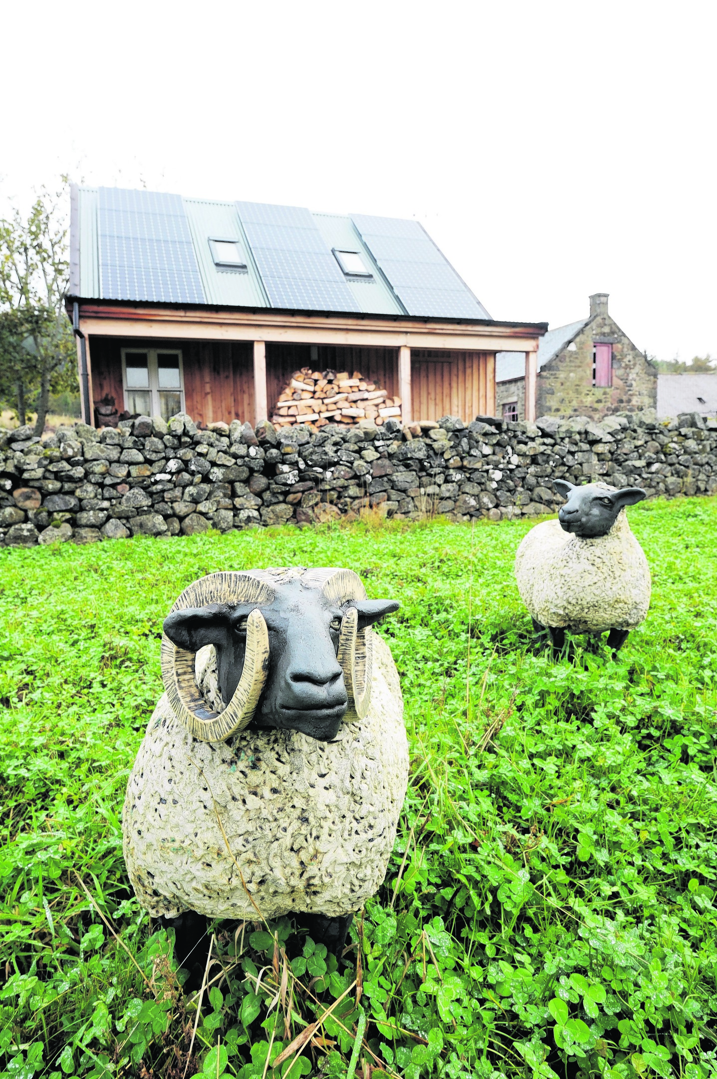
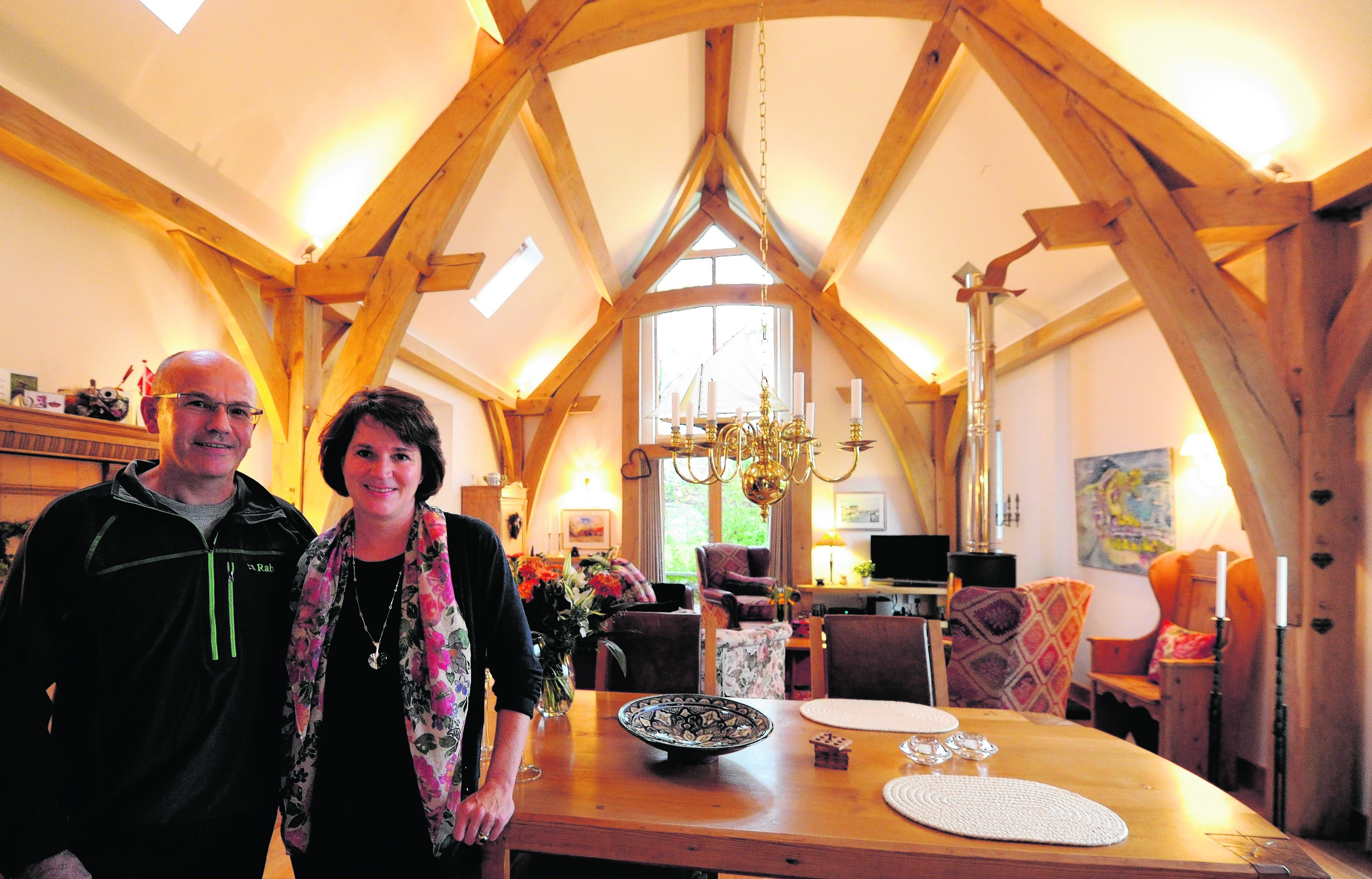
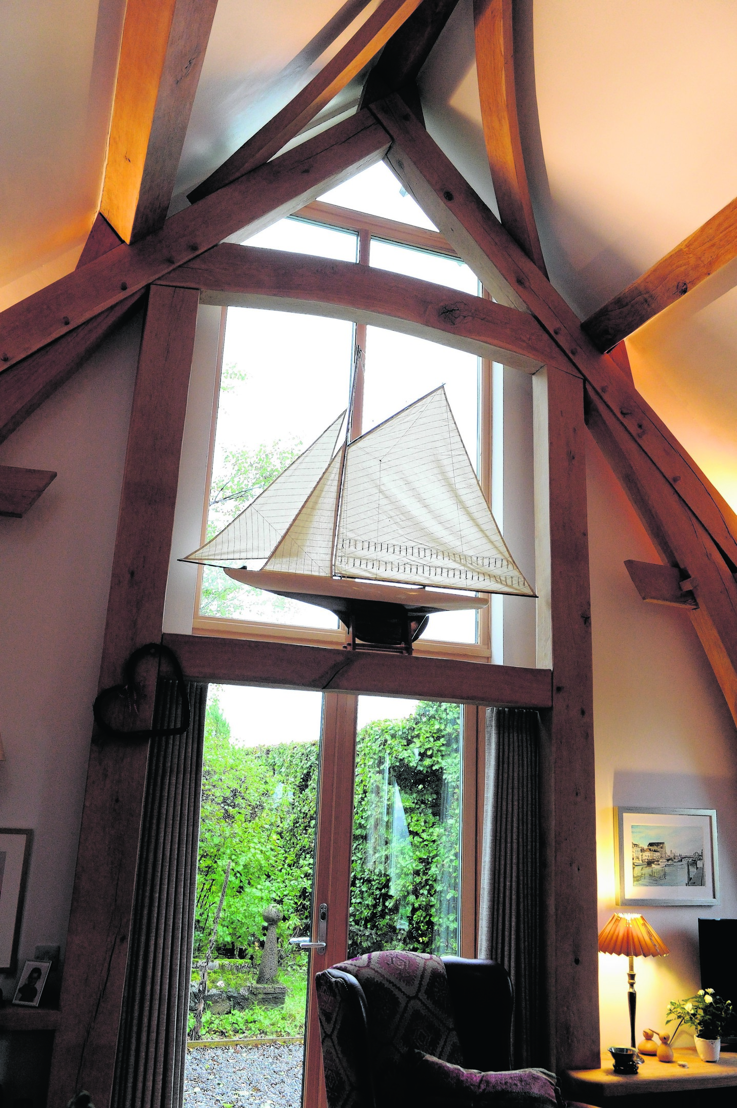
The house is a lovely mix of old and new. While the outside still retains the charm of the bothy, the inside houses a stunning piece of craftmanship and innovation in the form of the oak frame and stairwell.
There is an open-plan rustic kitchen with dining area and lounge which centres around a wood-burning stove.
Large windows everywhere flood the house with light while allowing you to take in the breathtaking views. Two large bedrooms with vaulted ceilings, main bathroom and a large en suite complete the downstairs.
Upstairs, there is a lovely cosy study with windows.
It is surrounded by a wild garden, and leftover stones from the bothy have been transformed into a delightful seating area and dykes around the house.
The couple are definitely happy with their creation.
Anne said: “It’s great because no matter what part of the house you are in, it is all getting used. Although it’s open plan, they feel like separate areas, so when you are in the kitchen you don’t feel like you are standing in this huge space.”
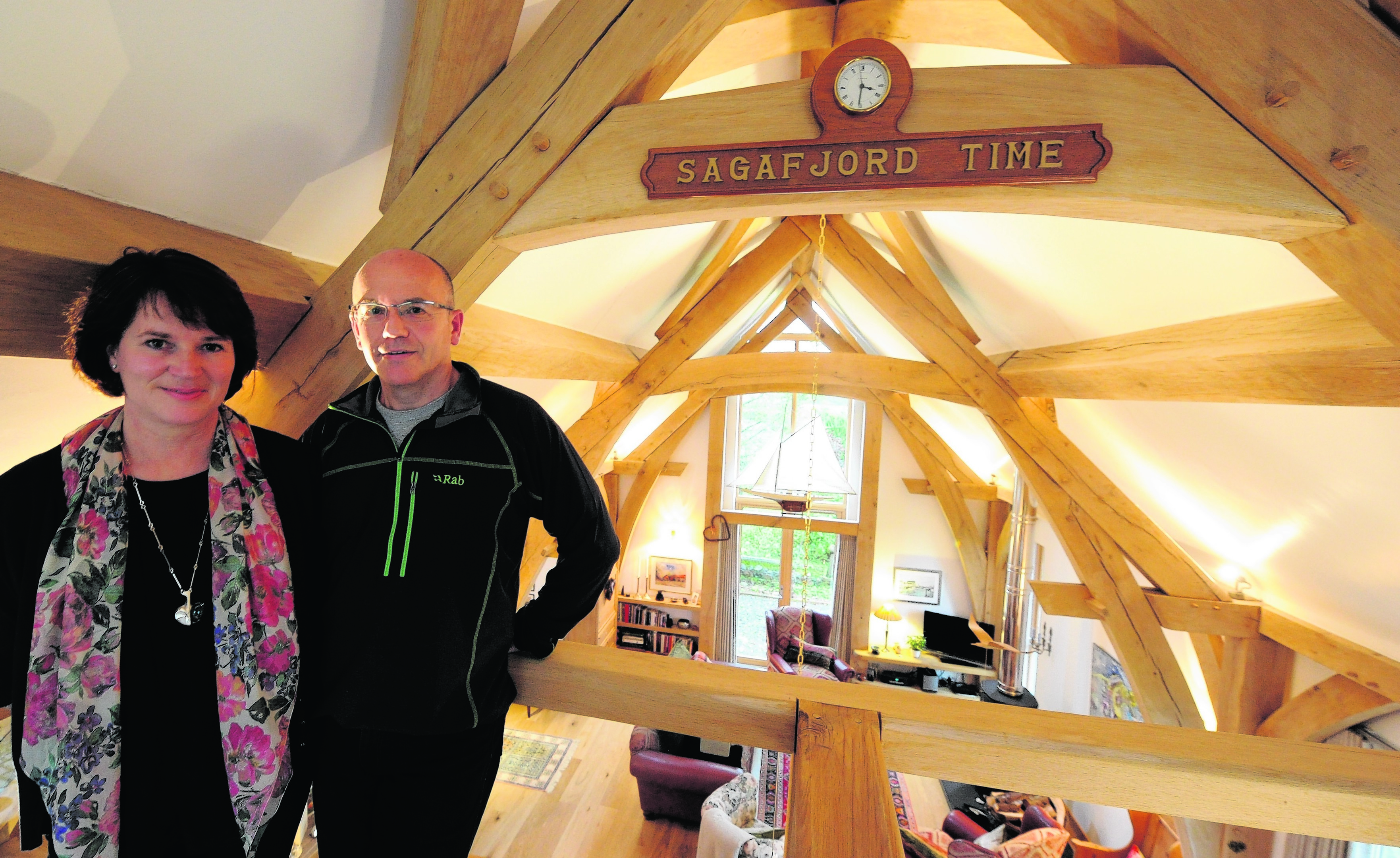
And they have Gaetan Goubet from Timber Design and Construction to thank for their very creative oak frame.
“When we first saw the frame being put together, we thought it was too small and that it couldn’t be for our house,” Anne said. “But it was amazing to see it all being put together and standing there all on its own.”
The frame is one of many stunning features in the home, including stable doors and brick work in the kitchen wall and counter that help blend the traditional feel of the home with its modern upgrade.
“We tried to keep it as original as possible, but just a modern version of it,” Anne added.
