These days it’s not strange to see some sky-high prices associated with primarily ‘everyday’ cars.
Over the years cars have become more complex, and more laden in technology and, as a result, they’re often more expensive than they used to be.
But Dacia? Well, Dacia has consistently bucked the trend in this respect, creating affordable cars through a largely no-frills approach.
The Sandero is the car that really put Dacia on the map and continues to prioritise affordability above all else. Recently revised, the new Sandero adds a fresh new look – but is it any good?
What’s new?

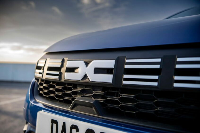
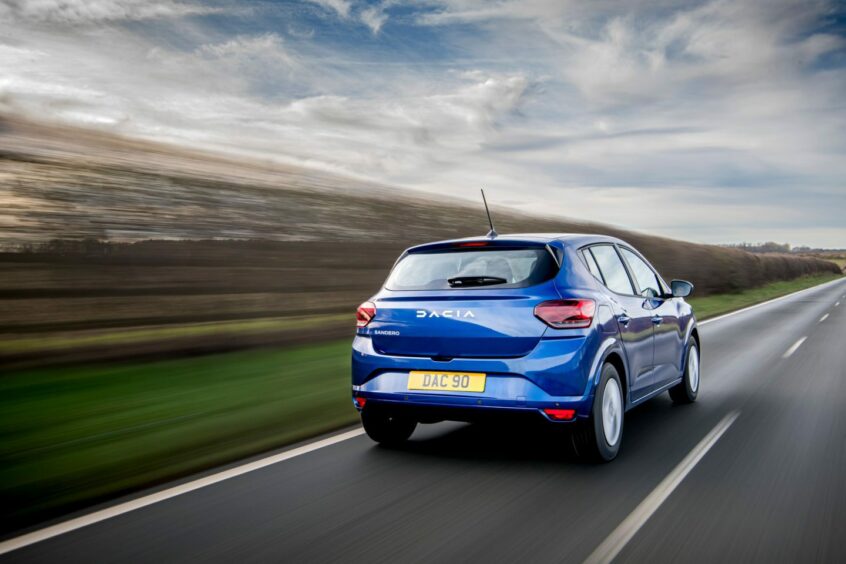
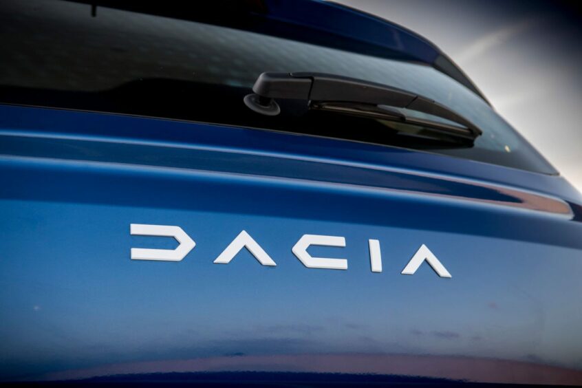
One of the most significant changes to this new generation of Sandero is the implementation of Dacia’s new logos. There’s the eye-catching ‘Link’ emblem up front, while around the back you’ve got the Dacia name emblazoned across the boot.
It feels like a more assured design direction by the brand and it makes the Sandero look more eye-catching than before.
But there’s still the same focus on value as before. Prices for the Sandero kick-off from £13,795, which makes it one of the cheapest new cars on sale today.
Under the bonnet
There’s still the option to get the Sandero with a bi-fuel setup that blends petrol and LPG gas for propulsion. ‘Our’ test car, however, used a far more conventional 1.0-litre turbocharged petrol setup that brings a modest 90bhp and 160Nm.
Driven through a five-speed gearbox, it brings a 0-60mph time of twelve seconds and a top speed of 109mph. Fast it isn’t, but that isn’t the primary goal for a car like the Sandero after all.
But though performance might not be on the Sandero’s side, it really counters when it comes to efficiency. Dacia claims up to 53.3mpg combined alongside CO2 emissions of 119g/km. The Sandero really shouldn’t prove too costly to run.
Driving
Easy and user-friendly, the Sandero is a car that you can instantly feel at home in. The gearshift is light and reasonably accurate, while the steering is equally featherweight so it’s great to use around town.
The engine, despite its small output, does quite a good job of getting the Sandero up to speed, though you tend to find that you have to hold a lower gear to get the best of it – lower down the rev range it feels a bit ‘bogged down’.
The ride is good, too, though there’s quite a bit of wobble to it. Accelerate hard and the car will lean back, while hard applications of the brakes will see the nose dive down.
It’s nothing too dramatic, mind you, but it does mean that the Sandero doesn’t corner or move quite as sharply as others.
Looks
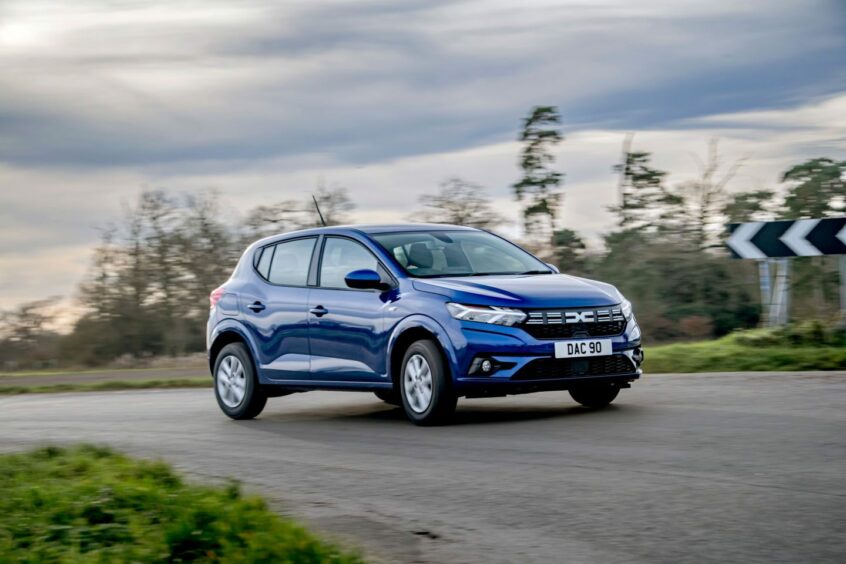
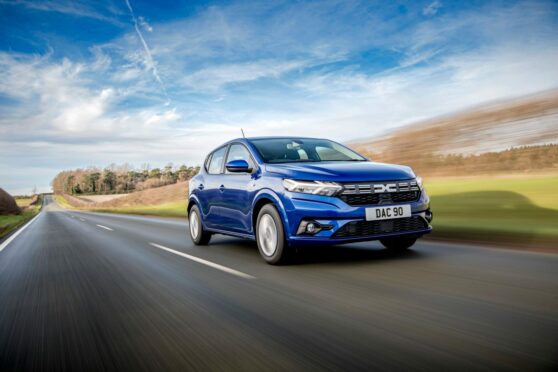
The aforementioned new logos and badges have had quite an impact on the Sandero. The new grille design helps too, bringing this car into classier territory when it comes to design. The Sandero also sits on steel wheels, but the covers are nicely designed.
Our test car also came in an attractive ‘Iron Blue’ paintwork which looks great in the sun and does quite a bit to elevate the look of the Sandero overall.
Inside
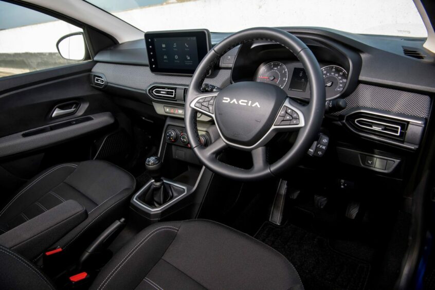
Sure, the Sandero’s budget-friendly nature is reflected in the variety of harder plastics you’ll find dotted about the cabin, but it’s not a bad place to be. Dacia has also covered the dashboard in a fabric-type material in a pattern which matches the one of the grille and this really does lift the feel of the cabin.
The buttons aren’t all that tactile, but the ones for the cruise control on the steering wheel are clearly laid out, while there’s also a stalk for controlling media functions mounted behind the wheel itself.
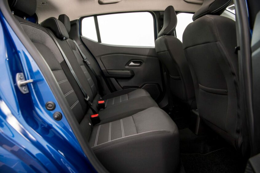
The front seats are comfortable despite being relatively thin, while there’s more than enough space in the back. You’ve got 328 litres of boot space, too, which you can expand by folding the rear seats down, though they don’t lie completely flat.
Spec
As we’ve mentioned, the Sandero has an entry price which undercuts pretty much everything else on the market. But it’s still got plenty of those must-have features off the bat, including air conditioning, cruise control and even Bluetooth connectivity.
Our test car was a higher-spec ‘Expression’ model which adds an eight-inch screen. The biggest benefit of this is the inclusion of Apple CarPlay, allowing you to easily mirror your phone’s display. After some non-included paint, our test vehicle came in at £15,445, which still feels like very good value.
Verdict
The Sandero feels like a car that’s needed now more than ever. With a low entry price, good equipment levels and a great level of efficiency, it’s a model that proves you don’t need to cut back in order to have a very agreeable way of getting from A to B.
It may be a little soft through the corners, but in all the areas that matter the Sandero really hits the mark.
The Facts
Model: Dacia Sandero Expression TCe 90
Price as tested: £15,445
Max speed: 109mph
0-60mph: 12.0 seconds
Economy: 53.3mpg
CO2 emissions: 119g/km
Conversation