Calendar An icon of a desk calendar. Cancel An icon of a circle with a diagonal line across. Caret An icon of a block arrow pointing to the right. Email An icon of a paper envelope. Facebook An icon of the Facebook "f" mark. Google An icon of the Google "G" mark. Linked In An icon of the Linked In "in" mark. Logout An icon representing logout. Profile An icon that resembles human head and shoulders. Telephone An icon of a traditional telephone receiver. Tick An icon of a tick mark. Is Public An icon of a human eye and eyelashes. Is Not Public An icon of a human eye and eyelashes with a diagonal line through it. Pause Icon A two-lined pause icon for stopping interactions. Quote Mark A opening quote mark. Quote Mark A closing quote mark. Arrow An icon of an arrow. Folder An icon of a paper folder. Breaking An icon of an exclamation mark on a circular background. Camera An icon of a digital camera. Caret An icon of a caret arrow. Clock An icon of a clock face. Close An icon of the an X shape. Close Icon An icon used to represent where to interact to collapse or dismiss a component Comment An icon of a speech bubble. Comments An icon of a speech bubble, denoting user comments. Comments An icon of a speech bubble, denoting user comments. Ellipsis An icon of 3 horizontal dots. Envelope An icon of a paper envelope. Facebook An icon of a facebook f logo. Camera An icon of a digital camera. Home An icon of a house. Instagram An icon of the Instagram logo. LinkedIn An icon of the LinkedIn logo. Magnifying Glass An icon of a magnifying glass. Search Icon A magnifying glass icon that is used to represent the function of searching. Menu An icon of 3 horizontal lines. Hamburger Menu Icon An icon used to represent a collapsed menu. Next An icon of an arrow pointing to the right. Notice An explanation mark centred inside a circle. Previous An icon of an arrow pointing to the left. Rating An icon of a star. Tag An icon of a tag. Twitter An icon of the Twitter logo. Video Camera An icon of a video camera shape. Speech Bubble Icon A icon displaying a speech bubble WhatsApp An icon of the WhatsApp logo. Information An icon of an information logo. Plus A mathematical 'plus' symbol. Duration An icon indicating Time. Success Tick An icon of a green tick. Success Tick Timeout An icon of a greyed out success tick. Loading Spinner An icon of a loading spinner. Facebook Messenger An icon of the facebook messenger app logo. Facebook An icon of a facebook f logo. Facebook Messenger An icon of the Twitter app logo. LinkedIn An icon of the LinkedIn logo. WhatsApp Messenger An icon of the Whatsapp messenger app logo. Email An icon of an mail envelope. Copy link A decentered black square over a white square.

Poll: Which Aberdeen Market design do YOU prefer?

Historians took a dislike to the proposed glazed frontage of the former BHS store. But what do you think?

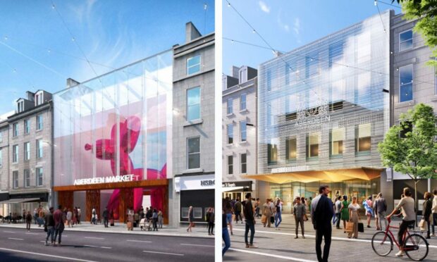
Artist impression of the new Aberdeen Market.
The design for the market's Union Street entrance was changed in June. Image: Halliday Fraser Munro/Aberdeen City Council.

Will a modern glass building help draw crowds back into the city centre? Or would such a design be a disgrace to Aberdeen’s granite roots?

Revised plans for the new Aberdeen Market have become a talking point among our readers, as many ponder over the council’s updated proposals.

The latest architect drawings of the multi-million-pound city centre site have posed yet more questions about how exactly the new development should look.

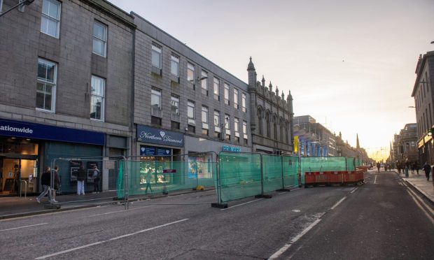
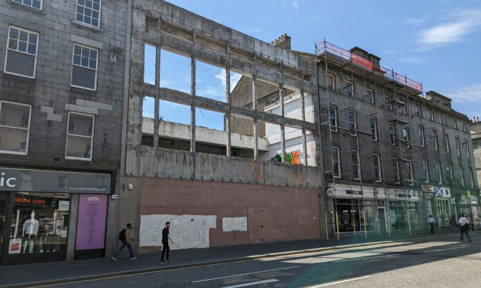
The former BHS, planned to become an indoor market, is located between two listed buildings. Image: Alastair Gossip/DC Thomson.

At the heart of the heated debate stands the market’s Union Street entrance and Aberdeen’s heritage of granite buildings.

And as opponents battle on social media, you can vote in our poll below to have your say. 

What are the two designs?

The Aberdeen Market proposals came to the forefront again last week after heritage groups branded the new designs as “disrespectful” due to the lack of granite.

Halliday Fraser Munro, the council’s architects, had initially suggested it would be best to keep the framework of the former BHS store and add a glazed front on top.

Slide left and right to see the changes in the design.

However, they later tweaked the designs – which now include demolishing the structure and replacing it with an all-glass panel to allow views through the market.

The changes have split opinion, sparking a debate whether the city’s new development should be built in a “modern” or “traditional” style.

‘We don’t want another monstrosity’

Some readers think the proposed building would become an “eyesore” on Union Street, while others said the design is “a travesty” and “a disgrace”.

Robin McIntosh wrote: “Usual architects’ rubbish regards to heritage elements – a big bit of glass is not going to ‘draw more visitors’.

“It’s a lazy way to homogenise the street, which will slowly start to look like every other high street.”

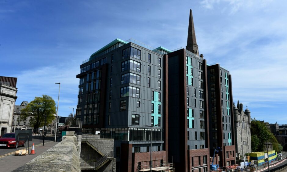
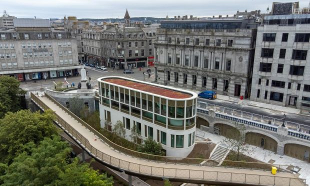
The £20m office/accommodation complex The Point was completed in 2017. Image: Kenny Elrick/DC Thomson.

Jeff Fraser added: “Even if it isn’t granite it should at least have some sensitivity in design, which this does not.

“Don’t want a repeat of that monstrosity at Triple Kirks that completely enclosed the original church tower and doesn’t match the material of anything around it.”

‘It’s time to embrace the changes’

However, others backed the “modern” design and likened it to developments in other “progressive” cities such as Berlin and Paris.

Anna-Maija Rist wrote: “Nordic cities have beautiful modern glass and steel buildings next to more traditional ones. They enhance each other.”

Wilma Collie echoed her words: “I’m all for keeping our history alive, but we have to move on. Maybe it’s time to embrace the changes.”

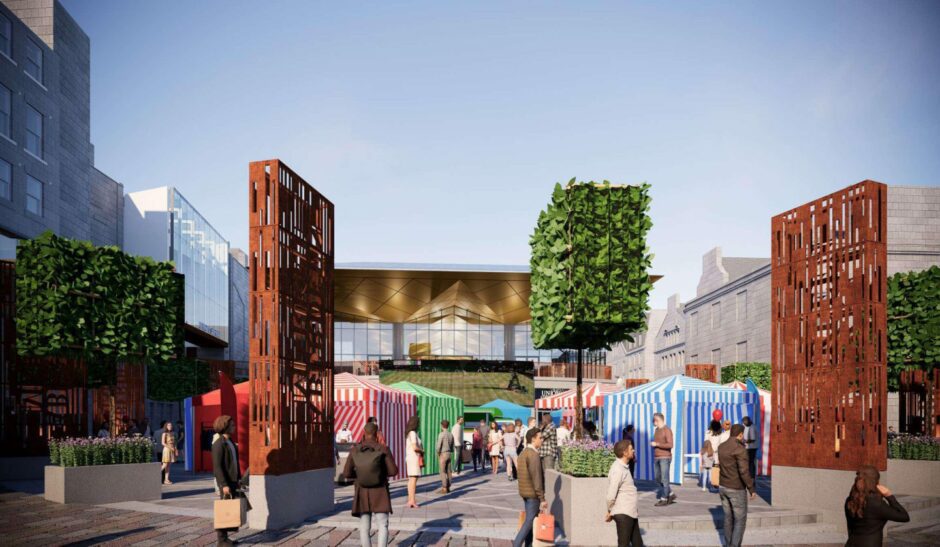
An indicative view of a street market on the Green, towards the new Aberdeen Market. Image: Halliday Fraser Munro/Aberdeen City Council
An indicative view of a street market on the Green, towards the new Aberdeen Market. Image: Halliday Fraser Munro/Aberdeen City Council.

What do you prefer? Share your views in our comments section below after voting


Martin Ross agreed: “Go into every other city in Scotland and you get lots of different and innovative building designs. Come to Aberdeen and what do you get? Dull and boring.”

Meanwhile, Aberdeen businessman Richard Tinto said: “Dammed if you do, dammed if you don’t. Let’s get it built and enjoy the vibe.”

Take part in our poll and have your say

You can read more on what historians had to say about the development here, and see the revised plans for yourself here.
Conversation