The people have spoken.
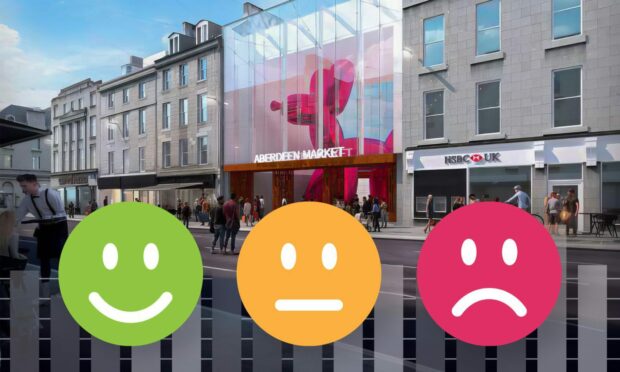
Earlier this week, we asked you to vote in our poll on the design of the new Aberdeen Market.
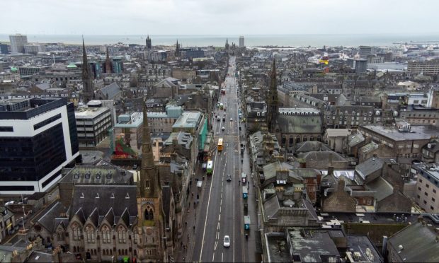
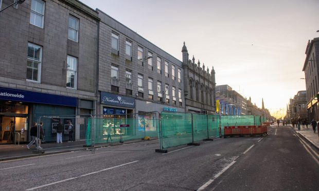
The multi-million-pound site is hoped to be a saving grace for the otherwise deteriorating Union Street, which now has around 40 empty units.
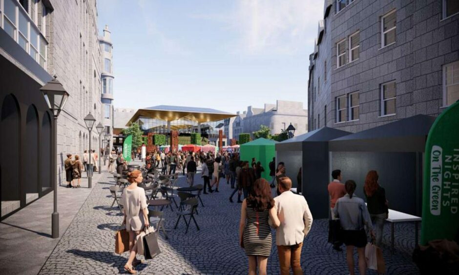
Council chiefs want the market to become a “dynamic beacon” in the city centre, drawing visitors – and businesses – back in.
And with so much at stake, the pressure to get every detail right is certainly on.
Could mixed reaction to designs put the project in jeopardy?
The project is now gathering pace, with the council’s preferred operator, McGinty’s Group, already drafting ideas for its future – including changing the market’s name.
There’s now a deadline to get it up and running by early 2025.
But as a heritage groups call for the designs to be re-done, there is a chance the opening date could be stalled.
In light of this, we decided to give power to our readers and see what their preferences are.
What were your two options in the Aberdeen Market poll?
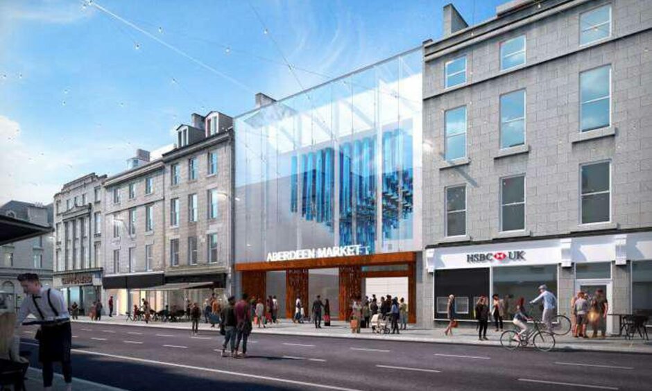
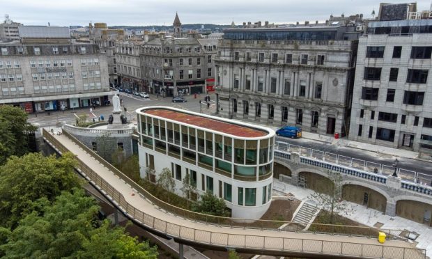
The latest concept for the market’s Union Street entrance caused uproar among historians.
Where before the BHS structure would be maintained, it would now be replaced with a glass front – deemed to look out of place.
We asked readers to pick their favourite between the new (left) and old (right) design:
And thus began the battle of designs.
What did we discover?
Almost 600 people took the chance to have their say.
The results from our poll, however, show there is no unanimous decision.

The votes were cast almost equally between the initial and revised designs, with the latter winning by about 10%.
A total of 263 people voted to keep the concrete structure of the former BHS store, while 322 picked the new design.
Meanwhile, a few on social media stayed neutral – whether saying no to either, or yes to both.
Norma Strachan wrote: “Love them. At least someone is taking the interest in the city to try and regenerate it and bring people back to the city.”
Syd Stewart said: “None, should match surrounding buildings to keep the character of the city.”
So what is the final verdict?
The winner – carefully picked by our readers – is clearly the revised design.
Taking a liking to the “bright and colourful” frontage on social media, most said this is the way to bring Aberdeen to 21st Century.
Of course our survey was only indicative, though the result may provoke some sighs of relief among architects hoping to avoid a return to the drawing board.
A recent progress report on the project says the development won’t be completed for at least another 98 weeks.
The planning application, available here, will need to be decided first.

Conversation