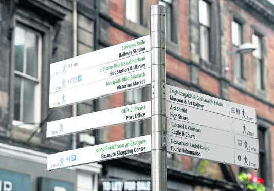
The “cluttered” and “unclear” street signs of Inverness could soon be a thing of the past as Highland Council unveils its proposals for clearer city centre signs.
Draft proposals show a variety of new signs to help locals – and the city’s 900,000 annual visitors – make the most of the Highland capital.
A six-week public consultation starts today following a recent assessment that found navigating Inverness unnecessarily difficult.
Issues such as maps that were surrounded by advertisements and looked “cluttered” while some street signs were broken or unclear.
That left those unfamiliar with the city unable to find what they wanted and therefore not appreciating it to the fullest.
Chris Taylor, Regional Partnerships Director at VisitScotland, said: “We welcome this draft strategy which seeks to improve signage in the city.
“Giving clear directions throughout the city centre will not only enhance the visitor experience but spread the economic benefit across the area as visitors take in the many wonderful sights.”
The council engaged with Inverness Bid, Inverness Access Panel, active travel groups, transport companies and public sector agencies to prepare the plans.
The current proposals show the locations for 10 upright signs and a further 23 so-called fingerpost signs.
There will also be a large-scale walking map with annotated line drawings of prominent buildings and features and an overview showing the city centre in its wider context.
The new signs will be introduced gradually as funding becomes available from grants, capital projects and developer contributions.
The Provost of Inverness, Helen Carmichael, said: “Inverness attracts around 900,000 visitors every year who spend time exploring Inverness on foot and by bicycle.
“To give them the best experience, we need to ensure that they can find their way around with ease.
“A review we commissioned to look at wayfinding in the centre of Inverness showed that the existing signage does not provide visitors with information to see all the city has to offer.
“There is no consistent city-wide mapping style and the information that is displayed can be unclear and look visually cluttered.”
“This consultation is a chance for people to let us know what they think about the draft plans to upgrade the wayfinding information in the city centre in order to provide well-presented information and directions to key locations.”
She added: “That will help visitors get the most out of their time in our city.”
