Ambitious redevelopment plans for Bught Park almost hit the skids today as Inverness councillors admitted they don’t like the designs.
Studying an artist’s impression of the new Bught pavilion, councillors didn’t pull their punches.
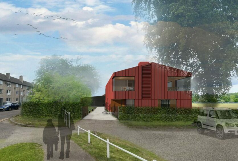
One called it a “big red blob” while another likened it to “an office block in Basingstoke”.
Members piled in with design suggestions. They asked if the red colour could be changed, if a balcony could be added, and why the building doesn’t have solar panels.
Exasperated planners told committee this is a planning meeting, not a design one.
Nonetheless, councillors briefly considered refusing the application, before finally agreeing to grant permission – with final designs going to local members.
Be bold or be bland?
Chairman Thomas MacLennan described the core issue as whether to be “bold or bland” in the Bught Park design vision.
Members including Bill Boyd and Angus MacDonald suggested the design should be more traditional. Mr Boyd wants to see more use of local Scottish materials, including dry stone dykes.
Mr MacDonald said his great grandfather and his brother were past presidents of the Camanachd Association and they would be disappointed with these designs.
Bill Lobban simply asked “Does it have to be red?”
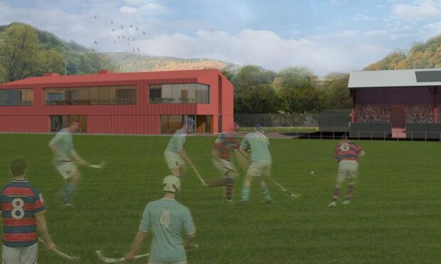
The planning application features a refurbished grandstand with an extension to the back housing new changing rooms. To the south west, a detached two-storey pavilion building including a shinty museum, offices and multi-functional event spaces.
The development will also include a revamped car park and a new one-way exit from large events onto Bught Avenue.
So far, so good – but the modern, simplistic design divided opinion.
The artist’s impressions rendered the pavilion bright red, which officers explained is based on the original proposed corten steel exterior. This weathers to a rust colour.
Since then, the design has evolved to include cladding instead, and planners stressed the colour need not be as bright as pictured.
However, members were not convinced. They felt the colour was a step too far, whilst adding that they’d have liked to see a balcony added to the front of the building.
‘Solar panels should be standard’
Members also took issue with the lack of solar panels on the design.
The council’s energy team has planned the whole development to be low energy, and allowed for solar panels in the grandstand. But the pavilion itself doesn’t feature solar panels.
Councillors slammed this as a missed opportunity. Bill Boyd said the council should not put up any buildings without solar panels, and should set an example to other developers.
Planning officers urged members to leave those details to the energy team.
Councillors Andrew Mackintosh and Russell Jones both welcomed the development, flagging its importance for the city and the sport of shinty.
However, Ken Gowans summed up the ambivalence felt by many.
“This is a very modern design,” he said. “I can’t make up my mind if this is something we should welcome or draw back from.”
Mr Gowans said it’s a shame that the Bught Park ice rink, leisure centre and pavilion are not connected in terms of architectural style.
While recognising the Bught Park development as a “huge step forward for the area” he added: “Half of me thinks this is good, modern, and the other half thinks ‘what are we doing?'”
The chairman agreed, asking the committee: “Should this new pavilion have conformity with the old one or should it be a total contrast and stand there proudly saying ‘I’m new, I’m modern?’
“I’m betwixt and between.”
Members told this is not design by committee
However, planning officials intervened in the debate. They reminded south planning committee that they were being asked to judge the current planning application on its merits.
Angus MacDonald and Laurie Fraser then tabled a proposal to defer the application until the council could undertake a redesign.
But the chairman took advice and told members they can’t just bounce the application back – the deferral would have to be a refusal.
At that point, Mr MacDonald withdrew his amendment.
Bill Lobban proposed that the committee agree the proposals as tabled, with the condition that the final designs come before local members and the committee chairman.
The committee agreed Mr Lobban’s plan, with Ken Gowans saying: “We don’t want the proverbial camel – a horse designed by committee.”
Are you interested in more exclusive and breaking Highland and Islands news from the P&J? If so, why not join our dedicated Facebook page HERE


