Calendar An icon of a desk calendar. Cancel An icon of a circle with a diagonal line across. Caret An icon of a block arrow pointing to the right. Email An icon of a paper envelope. Facebook An icon of the Facebook "f" mark. Google An icon of the Google "G" mark. Linked In An icon of the Linked In "in" mark. Logout An icon representing logout. Profile An icon that resembles human head and shoulders. Telephone An icon of a traditional telephone receiver. Tick An icon of a tick mark. Is Public An icon of a human eye and eyelashes. Is Not Public An icon of a human eye and eyelashes with a diagonal line through it. Pause Icon A two-lined pause icon for stopping interactions. Quote Mark A opening quote mark. Quote Mark A closing quote mark. Arrow An icon of an arrow. Folder An icon of a paper folder. Breaking An icon of an exclamation mark on a circular background. Camera An icon of a digital camera. Caret An icon of a caret arrow. Clock An icon of a clock face. Close An icon of the an X shape. Close Icon An icon used to represent where to interact to collapse or dismiss a component Comment An icon of a speech bubble. Comments An icon of a speech bubble, denoting user comments. Comments An icon of a speech bubble, denoting user comments. Ellipsis An icon of 3 horizontal dots. Envelope An icon of a paper envelope. Facebook An icon of a facebook f logo. Camera An icon of a digital camera. Home An icon of a house. Instagram An icon of the Instagram logo. LinkedIn An icon of the LinkedIn logo. Magnifying Glass An icon of a magnifying glass. Search Icon A magnifying glass icon that is used to represent the function of searching. Menu An icon of 3 horizontal lines. Hamburger Menu Icon An icon used to represent a collapsed menu. Next An icon of an arrow pointing to the right. Notice An explanation mark centred inside a circle. Previous An icon of an arrow pointing to the left. Rating An icon of a star. Tag An icon of a tag. Twitter An icon of the Twitter logo. Video Camera An icon of a video camera shape. Speech Bubble Icon A icon displaying a speech bubble WhatsApp An icon of the WhatsApp logo. Information An icon of an information logo. Plus A mathematical 'plus' symbol. Duration An icon indicating Time. Success Tick An icon of a green tick. Success Tick Timeout An icon of a greyed out success tick. Loading Spinner An icon of a loading spinner. Facebook Messenger An icon of the facebook messenger app logo. Facebook An icon of a facebook f logo. Facebook Messenger An icon of the Twitter app logo. LinkedIn An icon of the LinkedIn logo. WhatsApp Messenger An icon of the Whatsapp messenger app logo. Email An icon of an mail envelope. Copy link A decentered black square over a white square.

Call to cut number of signs in Inverness city centre

Inverness city centre

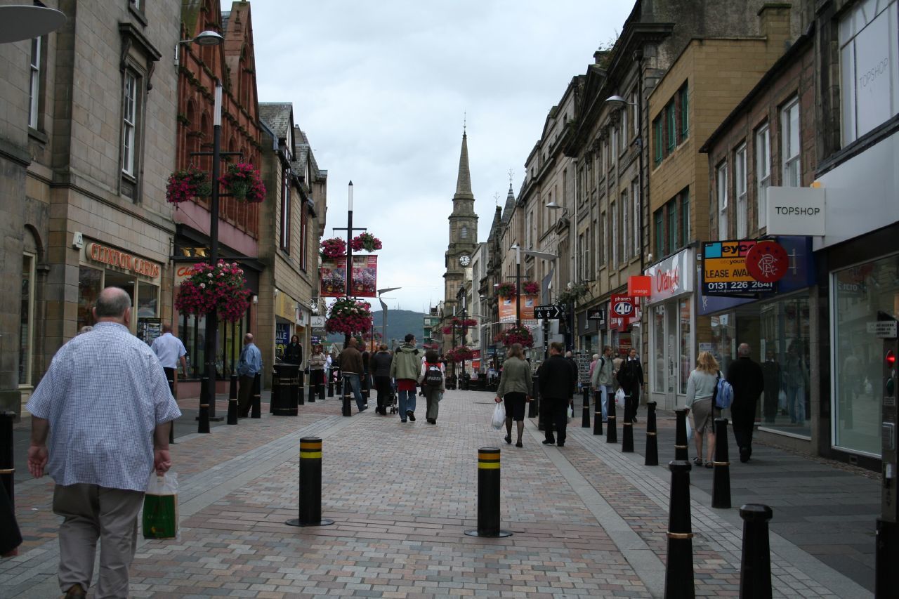
Visitors trying to find their way around Inverness city centre are hampered by a proliferation of difficult to read signs, according to a new study.

Now Highland Council is considering a project to revamp the signposts and make things clearer, and create “legible city”.

Large new monoliths with maps attached, similar to those installed in the centre of Glasgow, could be used.

A study was commissioned into “wayfinding” in the city centre last year.

It found it was difficult for people to plan their journeys and appreciate Inverness.

The signs were difficult to read due to “inappropriate text sizes, unsuitable typographic formats and information overload”.

The study also concluded that there was an “unhelpful profusion” of sign types and sizes, creating a “strong sense of visual clutter”.

The document also criticised the lack of an easily recognised city-wide style and the absence of maps.

According to a report to next week’s city of Inverness area committee by urban designer Una Lee, the new approach is based on the “legible city” concept.

This approach coordinates all relevant information to create a consistent network of maps and signs as used in Glasgow, London, Bristol, Birmingham and Leeds.

The existing, most prominent signs were erected by the council and Inverness Business Improvement District (Bid) in 2011.

The £37,400 project installed a range of steel “fingerpost” signs designed to direct people to local landmarks and tourist attractions.

As well as a Gaelic translation, the signs also give information about how long it will take pedestrians to reach their destination.

Inverness Bid manager Mike Smith said: “I would like to see information included about businesses so that if someone comes to the area and is looking for a bar or restaurant or gift shop, then there is a method of putting that in the mix.”

But there were mixed feelings among visitors to the city centre yesterday.

At Rose Street car park, Edinburgh couple Pam and Ross Donaldson were frustrated at losing £1 in a map vending machine.

Lisa Larsen, 52, of Colorado, said she found it difficult to find street names displayed on buildings.

She added: “Some are up high, some are down low. In America, we have a 8ft signpost with the names on and pointing towards them.”

Friends Josie Hamlett, 66, of Leeds, and Maggie Seymour, 58, of Wakefield, were using a map from the tourist information centre.

But Ms Hamlett said that text on the fingerpost signs was too small to read.

She said: “You need to get right up close to see them. But I don’t mind the Gaelic.”