For nearly a year now, the KFC roundabout on the eastern approach to Elgin has been confusing A96 drivers.
Despite there being very few, if any, complaints about the layout roads bosses have felt the need to tinker with the reasonably straightforward junction.
It is now on its third different layout since September last year.
After the first change provoked a wave of confusion and complaints, officials are now trying again with another revised layout of the A96 Elgin roundabout.
Have they got it right this time, and which one has been the best?
The Press and Journal has examined the pros and cons of all three layouts. You can have your own say in the comments section.
Why was Elgin roundabout layout changed in first place?
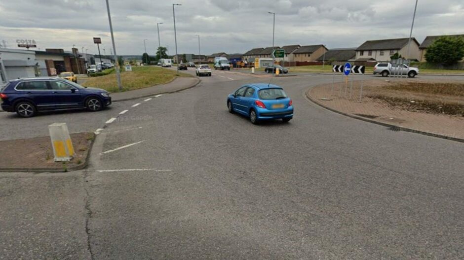
Ok, the KFC roundabout in Elgin wasn’t perfect, but was it really that bad before the changes started?
Google Street View images show that the only change since 2011 was when the KFC turnoff was created about 10 years ago.
During that time there have been few, if any, calls to change the layout of the busy A96 junction.
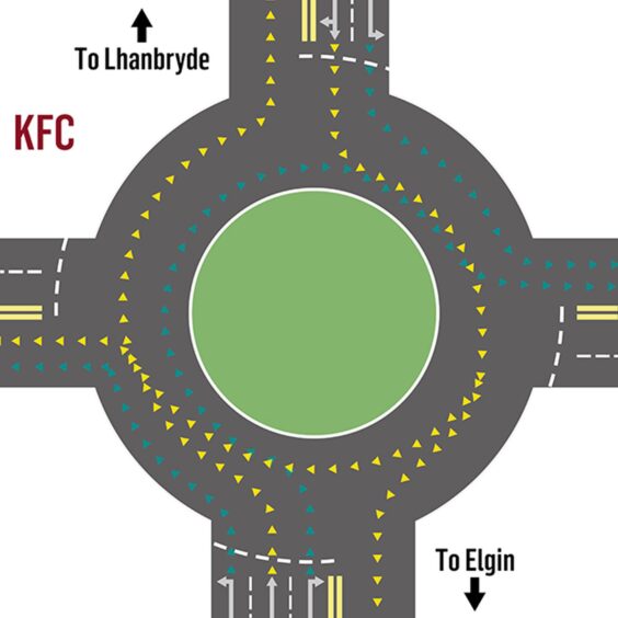
It was all reasonably straightforward.
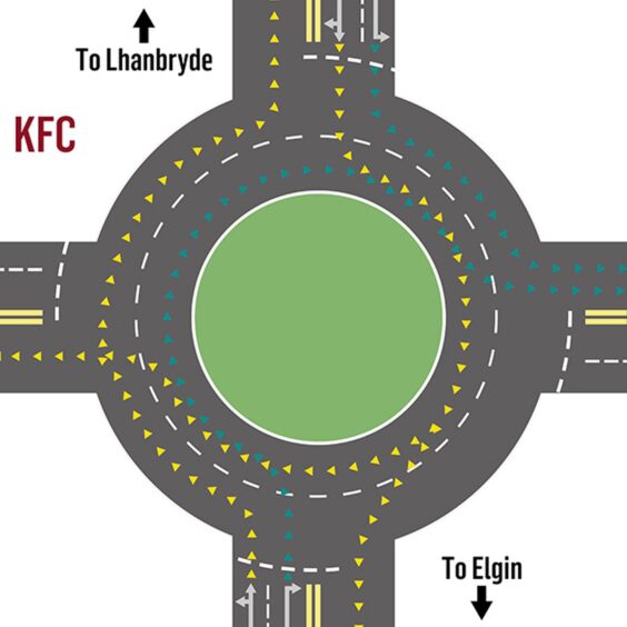
Three lanes if you’re leaving Elgin, one for left into KFC, one for straight ahead, one for right towards New Elgin.
Two lanes if you’re entering Elgin. Left for turning into New Elgin, right if you’re staying on the A96 or turning right into KFC.
Simple, yeah?
Ok, it was a little bit odd there were two lanes in one direction and three lanes in another, but it all seemed to work.
Yes, more businesses have been added to the KFC turnoff with Costa, a car dealership an electrical firm and Grampian Furnishers opening in recent years, which will all have changed the traffic flow at the junction.
It didn’t seem like a problem that needed to be fixed though, but it didn’t stop roads bosses from giving it a go.
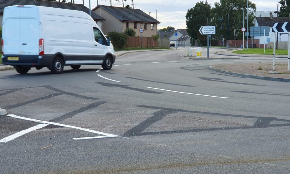
Confusing signs add to confusion over A96 Elgin roundabout revamp
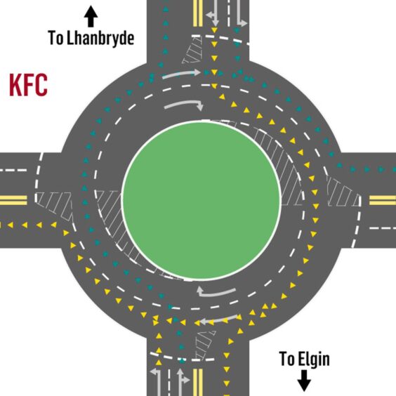
If the last layout was simple, this one wasn’t.
If road planners feel the need to add lots of markings and arrows telling drivers what to do, it’s probably because they know it’s not entirely clear.
First things first, it probably didn’t help that the day the layout of the KFC roundabout in Elgin was changed in September last year signs showing the old A96 arrangements had been left up.
It resulted in countless confused drivers arriving at the junction from Elgin to be met with a new layout they had not been warned about.
The changes were made at the same time as a much-delayed and over-budget Transport Scotland project to install new traffic lights and widen pavements.
When drivers arrived at the roundabout for the first time they were met with a wide range of new hash markings – some on the outside of the roundabout, some on the inside, some at the turn-offs.
It meant a lot less space on the roundabout was available for traffic with large swathes off limits with the new white lines.
Have your say in the comments section about which A96 roundabout layout in Elgin was best.
Changes to both A96 approaches also resulted in a lot less space for traffic.
From Elgin and the west, the three approach lanes were reduced to two, and from Lhanbryde and the east a traffic island was installed in preparation for new traffic lights, resulting in a squeeze.
The result was complaints from motorists in both directions of longer tailbacks approaching the roundabout on the A96.
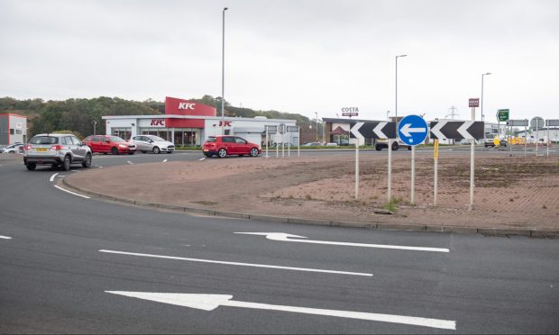
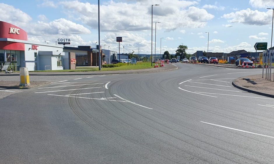
Is layout of KFC roundabout in Elgin finally right?
Fast forward to last month, and Transport Scotland has made more changes to the layout of the KFC A96 roundabout in Elgin.
Gone are all the white hash marks that limited the space drivers could use on the junction.
What has been left is a layout that is very similar to the one we started with at the very beginning.
The only change from that initial layout is that there are two lanes approaching the A96 roundabout as you drive from Elgin.
The change to the third layout in less than a year has not provoked nearly the same amount of confusion from drivers that the last one did.
Does that mean they’ve finally got it right? Or is there still a better way?
Have your say in the comments section.
Read more from Elgin
- We review all 10 A96 roundabouts in just two miles and ask: Is Elgin Scotland’s roundabout capital?
- How much did he cost? Why was he put up? What’s with the design? All your Dandy Lion questions answered
- Is Elgin a historic cathedral city or a large town? We try to clear up the confusion
Conversation