Imagine all the reasons you could have for not accepting a fantastic new job, one that requires you to up sticks and move some distance across the country.
Well, you might love your current home and not want to give it up. You might really like the area where you live and it would be too upsetting to leave. You might have to be separated from your loved ones and find it’s too much to bear.
Yep, all very persuasive, but how about not being able to take a new job or move homes because, in 2010, you bought a £99 weather station from Maplin?

Ugh, reading that paragraph back to myself doesn’t make it sound any less ludicrous.
But, yes, I’m moving jobs, which means I’m also moving homes. And, while my weather station can and will come to Braemar with me, the move means I’ll have to pull the plug on the wonderful work it has been quietly undertaking.
Weather varies enormously depending on location so, while I’m eager to embrace Braemar’s climate, the Fife dataset is definitely over. And, quite honestly, I think I’m in mourning.
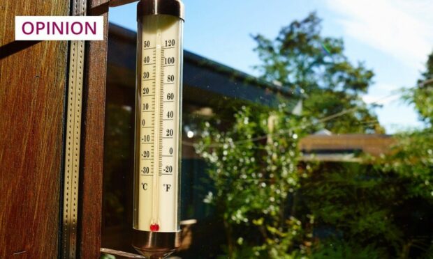
I can see it out the window right now, the weathervane swinging, the spinny thing spinning. “Spinny thing” is, of course, the non-technical term for the amenomenometer… or however you spell it. Does the M or the N come first? I can never remember.
[Editor’s note: Close, Ben – it’s anemometer.]
Being a part-time weather nerd is a serious business
Anyway, in heatwaves, gales, sunshine and blizzards, my Maplin station has been a reassuring presence, just outside the kitchen window, for the past 12 years. I bought it because I’m a weather nerd, yes, but I only ever wanted to study the weather in real time. It was about inspecting the present, not the past.
But, every five minutes since 2010, it has diligently pinged data to the receiver, recording everything that’s worth knowing about weather at a 280-metre altitude in the Lomond Hills: temperature, wind speed and direction, humidity, rainfall.
12.1C just now. Even though the day it's not even 9am that's the warmest January day I've recorded. Previous January maxes….
2021: 8.6C
2020: 11.8C
2019: 10.4C
2018: 10.4C
2017: 10.1C
2016: 11.6C
2015: 11.1C
2014: 7.3C
2013: 10.2C
2012: 8.7C
2011: 10.0C#Fife— Ben Dolphin (@CountrysideBen) January 1, 2022
I’ve supplemented it with my own observations of days when snow fell, and days when snow was lying. I take snow depth measurements, but never just a single measurement from outside the front door. Heavens, no. I’ll take several measurements from different locations and then calculate the average.
Being a part-time weather nerd is a serious business.
When I come downstairs in the morning, the data download is the first thing I do while the kettle is boiling but, on any given morning, the information is, for the most part, rather mundane.
Eight degrees celsius, 90% humidity, 3 millimetres of rain, 17mph wind from the north-west. Same as yesterday. Same as the day before that.
The climate changes, the more the weather stays the same
Day to day, there’s rarely anything newsworthy but, when you put it all together, the mundane becomes something else entirely – an accurate snapshot of weather and climate in the Lomond Hills across a fairly lengthy timespan.
And, while 12 years might be nothing in the grand scheme of things, it’s long enough for trends to emerge, and for changes to become apparent.
Snowfall, air frosts, ice days, all on a downward trajectory since 2010
The trends my data shows won’t come as a surprise. Most of the long-term average temperature lines on my graphs go up as time progresses, while pretty much every “cold” indicator does the opposite. Snowfall, air frosts, ice days, all on a downward trajectory since 2010.
Most interestingly, while the upward creep of average temperatures is being driven by increases by both day and night, the latter is more pronounced.
Nights in the Lomond Hills have warmed more than the days, leading to a narrowing of the temperature range where I live. Ironically, here at least, it seems that the more the climate changes, the more the weather stays the same.
Weather stats aren’t as popular as bunnies
At the start of every month, I post a graph on my blog showing the overall average temperature for the previous calendar month, from 2010 to the present, along with a commentary.
Winter's last hurrah? I do hope not 😉 pic.twitter.com/rHQCFtI3Fc
— Ben Dolphin (@CountrysideBen) April 9, 2022
The posts don’t get much interaction compared to the piccies I post of cute wee bunnies, blazing sunsets or snowy mountains. In fact, the weather graphs are the worst received of all the things I post. A photo of a tick lodged in my armpit gets more engagement. But, I persist because… well… it feels a bit like a public duty.
So, imagine my surprise and delight when, just last weekend, one of my regular conservation volunteers asked: “Will you have to move away with your new job?”
“Yep,” I replied.
Without hesitation, she exclaimed: “BUT WHAT ABOUT YOUR WEATHER STATS!?”
Quite!
Ben Dolphin is an outdoors enthusiast, countryside ranger and former president of Ramblers Scotland


