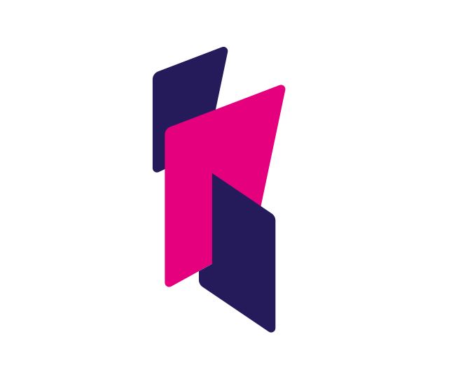
The logo for Scotland’s new benefits agency, which is supposed to based on the Scottish map, has been attacked for failing to include the islands.
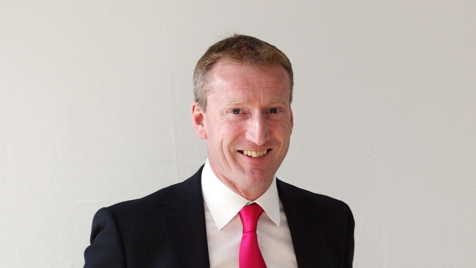
Shetland MSP Tavish Scott yesterday claimed the ‘Social Security Scotland’ design, commissioned as part of a £73,000 Scottish Government branding exercise, ‘overlooks’ islanders.
A document released by the Scottish Government reveals the image was created during a seven-month process which saw 15 focus groups discuss potential “names, logos and straplines” for the new agency.
The focus groups were held all over Scotland and included sessions in Inverness and Shetland.
Participants were shown “mood boards” to demonstrate logo options and used post-it notes and flipcharts to discuss branding.
The Social Security Scotland logo representing Scotland without its islands


In the end a logo inspired by the map of Scotland was chosen. But the image excludes any representation of the islands, despite concerns being raised at the time.
A Scottish Government document detailing the process noted: “Participants from islands strongly felt that a representation of the map of Scotland should include the islands.”
Last night Mr Scott agreed. The Shetland MSP said: “The islands cannot be overlooked, particularly on the important issue of social security where islanders are just as important as anyone else across Scotland.”
Mr Scott was the driving force behind new laws to ensure that public bodies represent the Shetland islands accurately on public documents involving Scottish maps.
And he said it was unacceptable to spend so much money on a logo that “simply ignores the islands”.
“Back to the drawing board,” Mr Scott added.
The image appears on Social Security Scotland branding alongside the strapline “Dignity, fairness and respect” – wording that was also decided during discussion with focus groups to reflect the values of the organisation.
The new agency, based in Dundee, has been created to administer newly devolved benefits which have come to the Scottish Parliament.
A Social Security Scotland spokesperson said: “Our logo is an abstract representation of Scotland.
“It is not intended to be a map – it is a marque that over time we hope will help people to identify communications from Social Security Scotland.
“Our name, logo and wider brand were developed working with the Scottish Government Experience Panel.
“This is a group of 2,400 volunteers with experience of the current UK benefit system. Their priorities for this logo were to present our organisation as vibrant, progressive and welcoming and we believe this logo and our brand colours do just that.”
